READ MORE
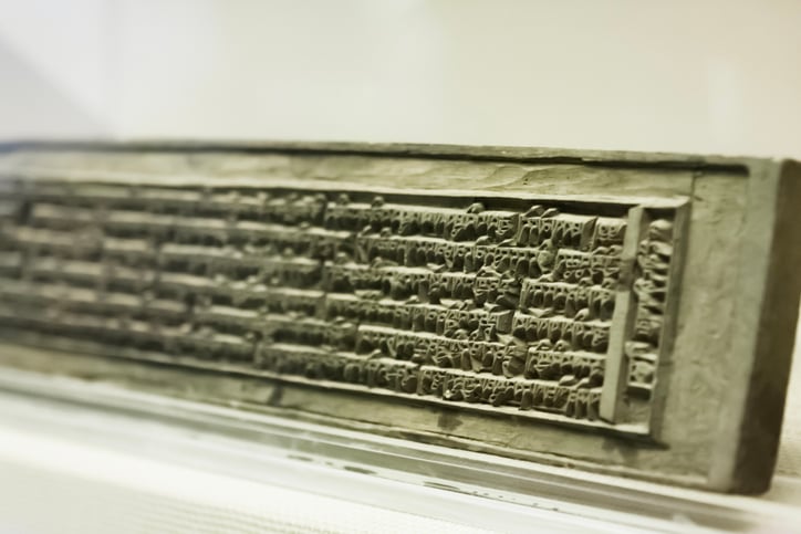
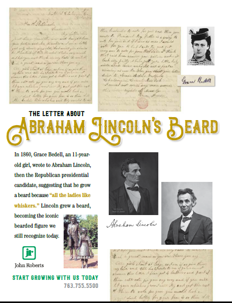
The Year was 1040


READ MORE
Fulfillment
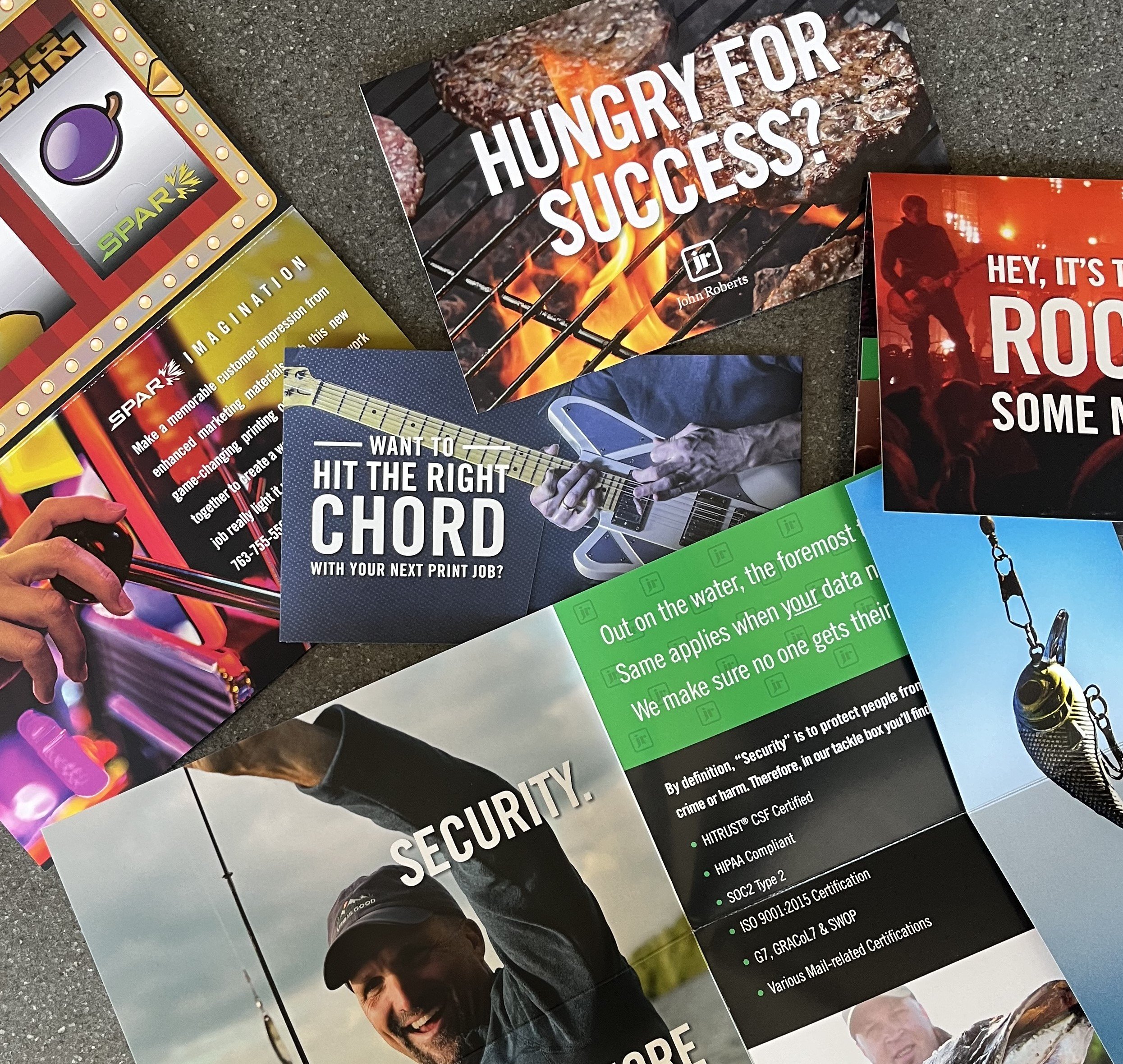
Important Things Come In Envelopes!

READ MORE
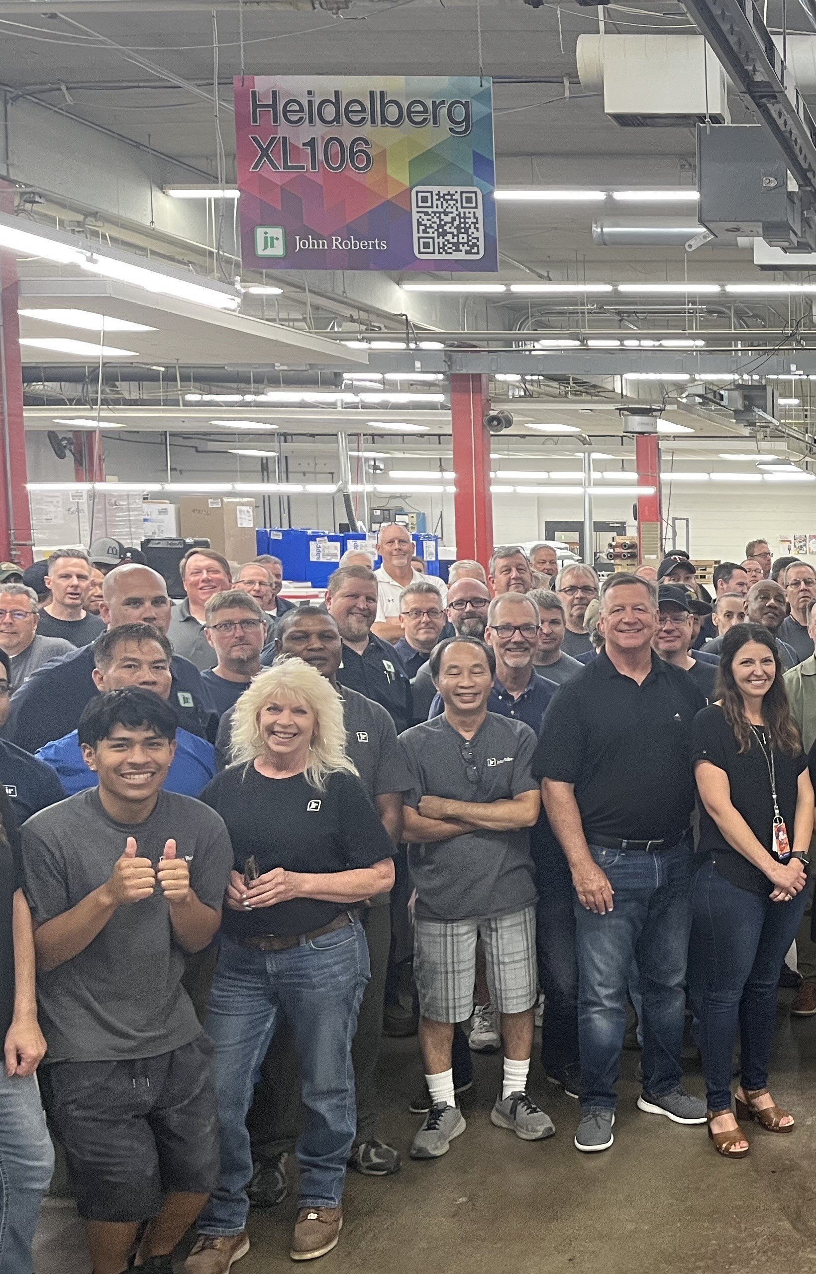
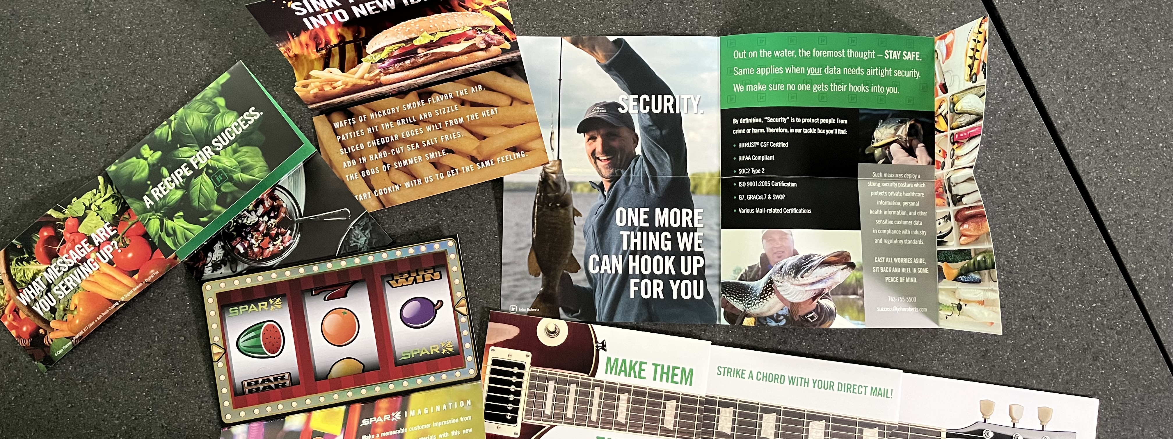
Design

Fulfillment
Design