November 5, 2015 at 10:25 AM
Engaging Direct Mail Ideas (On the Cheap)
I’ve seen a lot of mail, and I can tell you that a lot of it is the same. Different content, yes, but the carrier is often a #10 envelope or a large card (a “billboard” as they call it in the mail industry). Now, I’m not knocking these staples in the mailing industry — they’re proven formats that can be very effective, however they’re predictable.
These days I study all of the different ways we can be engaging as direct marketers, and the great news is, you don’t have to spend a ton of money to stand out. Today I’m going to share with you a few of my favorite “cheapskate” direct mail ideas.
Make it Zip
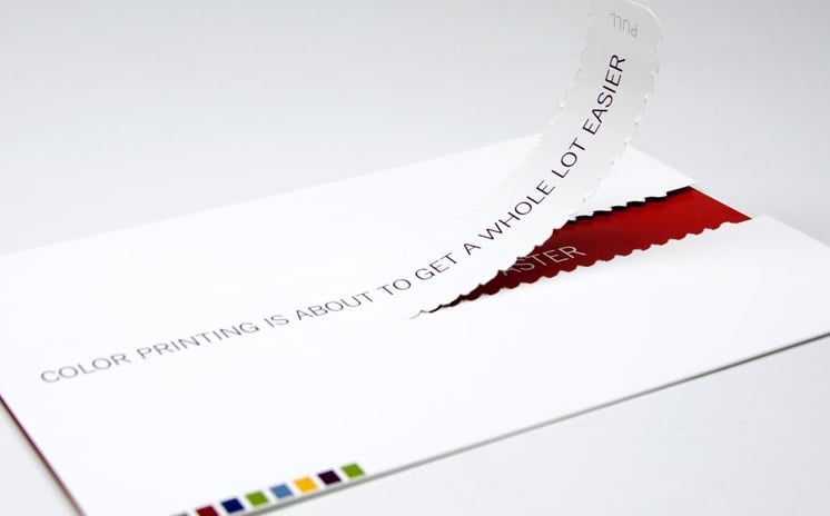
Zip strips are wonderful little mechanisms that work like paper zippers. They’re fun to pull and they offer a more interesting way to get into an envelope or a folded self-mailer. I like to combine the zip strip with a message to get extra impact. For example, when closed, maybe the zip strip has a message printed on it, like “Pull here to reveal your bonus savings,” and then when the customer pulls to open the piece, the answer is revealed below.
Peek-a-Boo
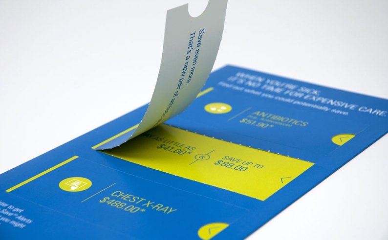
Giving people something to do is a solid strategy for mail, and peek-a-boo windows offer an easy way to make your customers and prospects interested and curious about your mailing. Who can resist little pull-up sections that reveal images or messages? Peek-a-boo panels are super-easy to create, too. Think of a two-panel folded mailer. Now print it on both sides and add a three-sided perfed window with a score/hinge on one of the two panels. Glue the panels together, and that’s it! Lift and reveal.
Made You Look
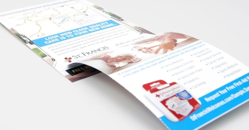
Visual tricks are, hands down, my favorite of all of the low budget solutions. You can do some really neat things with just a photo or two and a simple folded format. Think of it like this — how can you get someone to interact with an image? I have a sample in my collection from Best Buy, and the cover is a giant oven, and the panel that opens is the “door” of the oven. So, when you open the piece, you open the door to see what’s inside the oven. You can use this strategy with panels or with peek-a-boo windows and zip strips. Visual tricks are always engaging and lots of fun.
Touchy-Feely
Special press coatings and print effects can be a great way to get attention, and there’s a lot of neuroscience research to back it up. In short, humans respond to touch, and touch provokes emotional response. Since paper is tactile, as marketers we have a lot of control over the tangible experience of receiving our marketing communications. So why not make them irresistible? Add a soft touch UV press coating for a rose petal feel. Add a sandpaper UV coating to add distracting texture and grit. Digital print effects like raised clear ink and white ink on colored papers are distracting and beautiful. Super smooth or textured envelopes can stand out, too.
Go get ’em, Tiger!
So, I hope this has given you some good ideas to get you started. And remember that the fun strategies mentioned above are not mutually exclusive. You can layer them together for more and more engaging solutions. Try a self-mailer with a peek-a-boo window that teases a visual trick and uses a soft touch UV coating on the outside. Get it? It’s fun! So, I challenge you to try something new and engaging in your next direct mail campaign.
Popular Posts
Memorial Weekend
Landing Pages
Learn Why Omnichannel Marketing is Trending
Direct Mail
