October 10, 2013 at 5:07 AM
 For the past couple of years, a new web design term has been hot on the development market, Responsive Web Design. The idea behind this development technique is simple, design one layout that looks beautiful on any device, period. Want to display the website on a 50” LED TV, no problem; need to view this page on a tablet, done; want ease of navigation on an iPhone, Android, or other smart phone, just design responsively.
Gone are the days of coding a separate mobile optimized website. You know… the whole m.yourdomain.com thing—there is no longer a need for this. One URL will work on any device, and you can achieve it all with CSS and HTML alone (JavaScript not required, although always welcome). This is possible using fluid images, fluid grids, and media queries. Although there are some smaller details to consider, the aforementioned items will provide you with a great start.
What about Adaptive Design?
Another technology, Adaptive Web Design—introduced around the same time as Responsive Web Design—allows you to design your site to fit various screen dimensions. When you resize your browser or view a website on a particular device, the layout will automatically change. This technique primarily uses media queries (or swapping out CSS files using JavaScript/jQuery), but with limited or no fluidity involved.
This technique achieves the same end goal, but does so in a noticeably choppy pattern. With larger screen formats being introduced and the ease and ability to fit multiple windows on a screen, it makes it ever more important to provide the end user with a fluid experience.
Which approach is best?
What is most notable about Responsive Design is that as you resize your browser window, the site adjusts in a fluid like motion. In other words, it is quite flexible. Designing a site that is only Responsive is easier said than done, and ultimately it is in good practice to take the best of both worlds and incorporate Adaptive and Responsive Design techniques. This allows you to design layouts that will function better on a mobile device, but can scale to any device while still looking pro, all within one CSS file with zero JavaScript requirements.
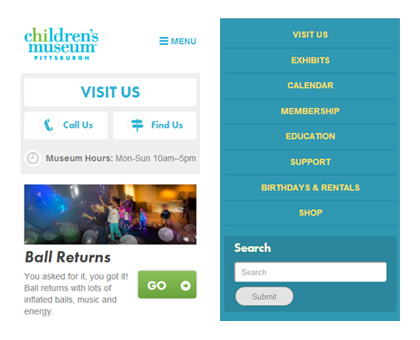
It is of my own opinion that a true Responsive layout transforms to provide the mobile end user with a better experience. Take for example a navigation bar—displaying this bar horizontally from mobile to desktop versions is not user friendly. A common technique employed in place of this is to add a menu-like button to the upper corner once the browsing device’s width reaches a certain requirement. The Pittsburgh Children’s Museum is a great example of this.
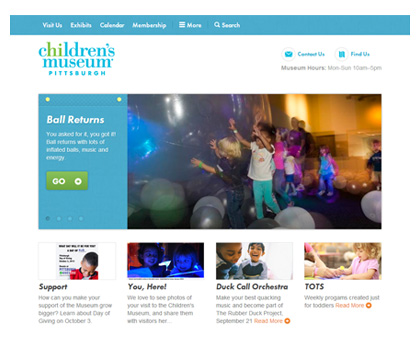
Notice how when you resize your browser (or view it on a mobile device), that the navigation menu disappears and in its place is a Menu button. Upon clicking the menu, rather than using JavaScript to fly the menu in, the page jumps to the bottom where the navigation menu is now stacked. This is a great example of using Responsive Media Queries in CSS while also allowing for Adaptive Design.
What do we call this approach?
In actuality, this is where the confusion sets in. Most people call what I just explained as Responsive Design. From reading this article, you are among the wise if you would say it is a combination of two ideas. In the end, I would call it Responsive and not Adaptive. Think of it like the epic Blu-ray and HD DVD battle of the past decade. Ultimately, one technology is superior and attracts more buyers, thus leading to market domination. From what I have seen, that is exactly what has happened with Responsive taking the edge over Adaptive. The difference with this battle is that the winner is leeching some of its competitor’s techniques to make it the dominate player.
Even though sites claiming to be Responsive in nature ultimately are using some Adaptive techniques, it is best to coin the term Responsive as that is what the current industry is looking for and it is what you should market toward. Just remember, to be Responsive, you need to have a fluid layout that looks good no matter what device you are using to view your website.
Popular Posts

Memorial Weekend


Landing Pages
Learn Why Omnichannel Marketing is Trending


Direct Mail