March 1, 2018 at 11:56 AM
Colors fill our world and (literally) frame what we see. Colors are also key for successful direct mailings. The right color can invoke a mood that harmonizes your campaign, while the wrong color can at best send a mixed message, at worst make a direct trip to the recycling bin.
Don’t discount the importance of color in your direct mailings. Today we’re going to do a quick dive into color psychology and what you should choose for your campaign.
Red – Power & Excitement
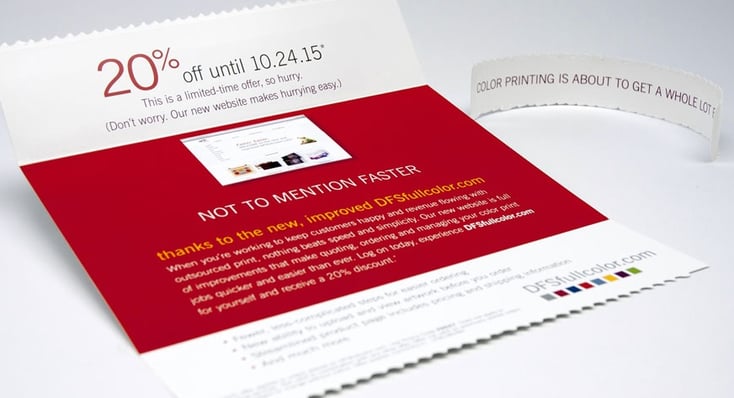
Red is a bold color that embodies passion and energy, as well as fearlessness and love. Red can also signal danger or warning, so it can be a useful color for playing with expectations. Red is a fantastic color to use when you want to inspire an immediate reaction – like opening a mailer or making a purchase.
Orange – Confidence & Warmth

Just like autumn leaves and a roaring fireplace, orange conjures up feelings of warmth, energy and friendliness. Orange is a great choice for mailers dealing with stressful or overwhelming topics – the comforting color can help the task feel less daunting.
Yellow – Happiness & Optimism
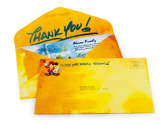
The color yellow is associated with sunshine and renewal. This bright color is the choice for many brands that want to embody creativity and optimism. Yellow is fantastic for mailers that are family-oriented or want to capture a youthful feeling.
Green – Health & Nature
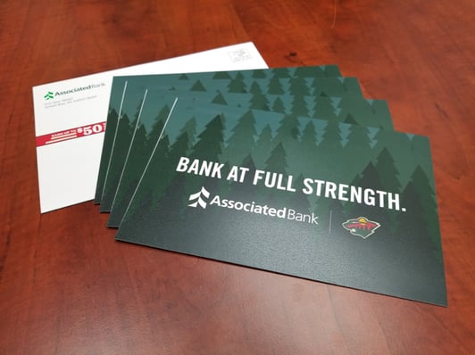
Green is associated with many natural or environmentally-conscious brands because it invokes new growth like grass and trees. Green signals good health and prosperity. Choose green when you want to send a clear message about your brand.
Blue – Serenity & Security
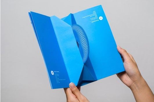
Blue is truly a unique color. It has a calming effect on the mind which opens the path for trust and dependability. Many people associate blue with corporations because it’s a favored color with financial institutions and hospitals.
Purple – Power & Wisdom
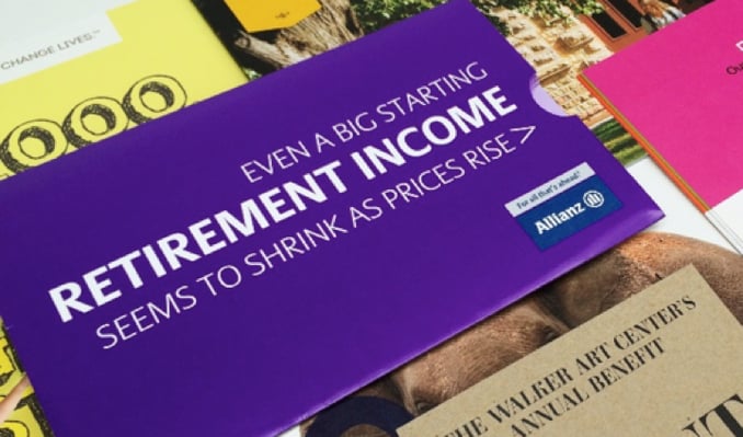
Historically, purple has been the color of royalty and that association still rings true today. Purple is associated with prestige, wisdom and sophistication. Choose purple as an option when you want to bolster your customer’s sense of self.
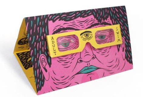
Pink – Youthfulness & Passion

Typically associated with femininity, pink has become a unique color choice designed to capture attention. It’s associated with youthfulness, passion and creativity. Pink is a great choice if you want your mailer to stand out from the crowd and feel more youthful.
Black – Sophistication & Elegance
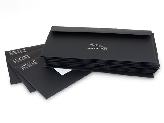
The sleek look of black has made it a popular color to convey luxury and power. Many upscale brands use black in their logos to signify power and elegance. Black is a great color choice for a streamlined look and feel for your mailers.
White – Cleanliness & Simplicity
White is a go-to for tech brands as it presents a modern appearance. White has typically been associated with purity and pristine. White in direct mailings should be used strategically to avoid looking plain.
No matter what your direct mailing goal is, utilizing color is a fantastic way to empower your messages.
________________________________________
The John Roberts Company is a full-service marketing execution company, providing a variety of services including: commercial printing and packaging, mailing and digital marketing services, and more. To learn more about our company and how we can help you succeed, get in touch today.
Popular Posts
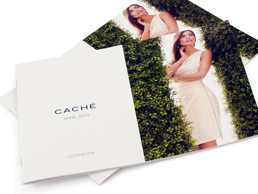
Memorial Weekend


Landing Pages
Learn Why Omnichannel Marketing is Trending
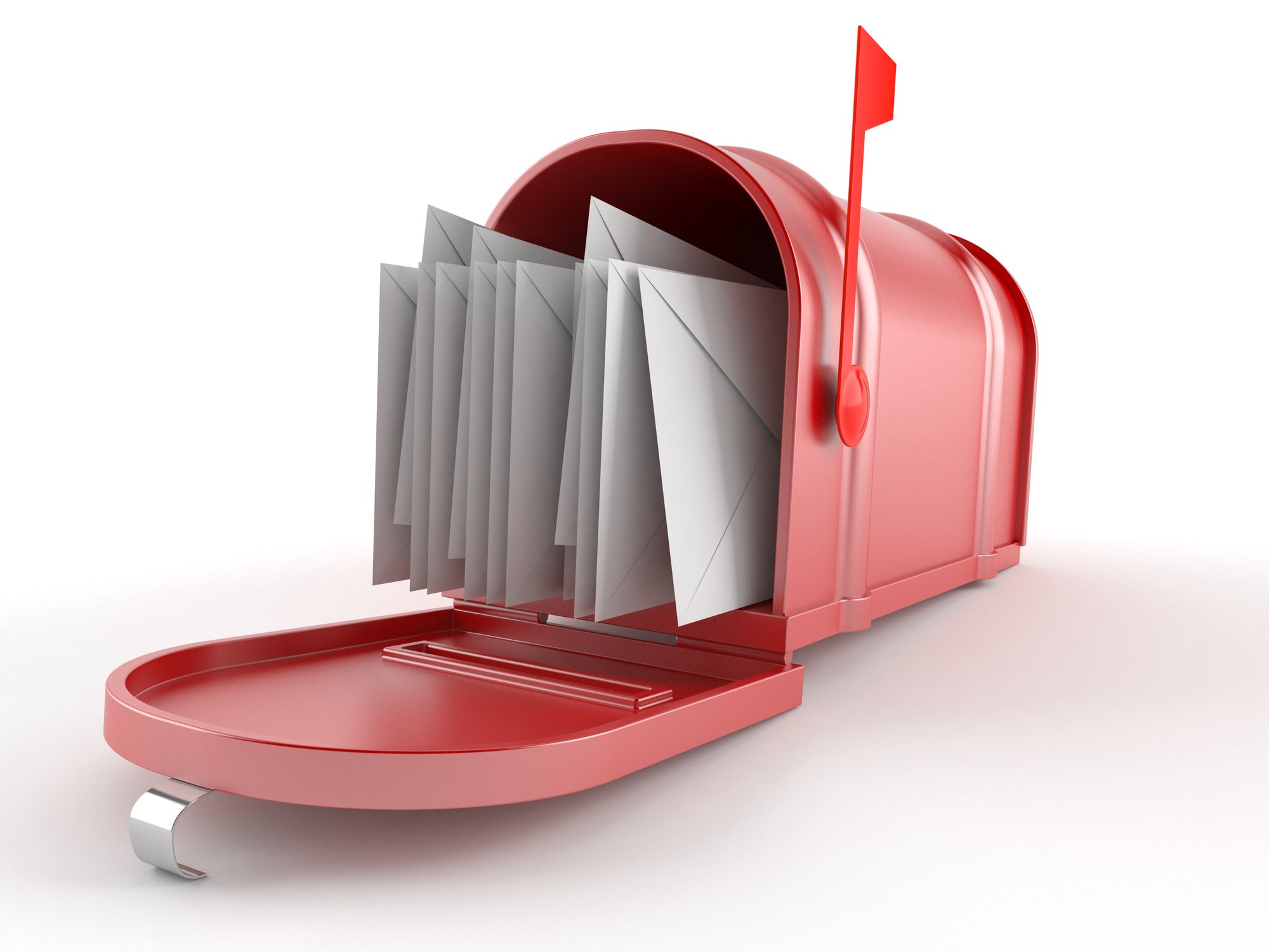

Direct Mail