April 24, 2015 at 7:30 AM

On Tuesday, April 21st, 2015, Google made a massive change to the way it ranks websites. The change comes down to one very important criterion: whether your website, landing pages, and blog are fully optimized for mobile.
Google announced the change on its Webmaster Central Blog back in February and has done a thorough job ever since preparing marketers and website owners to predict how the change may affect their site and search traffic. They explained, "starting April 21, we will be expanding our use of mobile-friendliness as a ranking signal. This change will affect mobile searches in all languages worldwide and will have a significant impact in our search results. Consequently, users will find it easier to get relevant, high quality search results that are optimized for their devices."
If your site isn't fully optimized for mobile devices, you will likely see a hit to your ranking on mobile searches. To determine your readiness, you'll want to start with Google's free assessment tool that will tell you exactly what you need to do to prepare for the new mobile search algorithm.
When you run your site on the tool, you'll get a quick assessment of whether your mobile rank will suffer as a result of the April 21st change. If your website is fully optimized for mobile, you'll get a success message like this one:
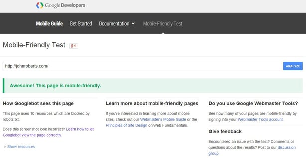
You'll also get a visual of how the Googlebot "sees" your webiste. (For example, in our screenshot above, you'll see that in The John Roberts Company's blog, there are 10 resources which Googlebot can't "see" because we've blocked them with a robot.txt.file. That's no big deal, but it's good to know nevertheless.)
If your website, landing pages or blog are not ready for the mobile update, you'll get a message that looks like this:
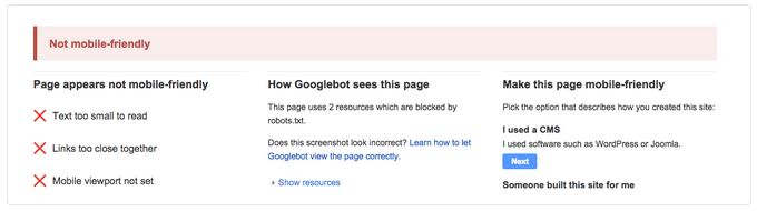
Along with the failure message, you'll get a few pointed bullets on the reasons your content failed the test. Above, you can see the mobile viewpoint is not set, the links are too close together, and the text is too small to read. While this may seem like you'll need to do a whole detailed redesign to fix each error, moving to a mobile optimized content management system, blog, or landing page tool will likely fix most of them.
In addition to the mobile-optimization tool, Google has also put together a list of common mistakes to avoid in optimizing your site for mobile devices and the algorithm change.These mistakes include using flash video and other unplayable content types on mobile as well as having a slow mobile site.
If your site is not mobile-optimized, you should try to move quickly on it because every day that your site isn't optimized for mobile is a day that you'll lose traffic. Estimates of mobile search volume vary by industry, but one thing researches have seen is that companies with mobile-optimized sites triple their chances of increasing mobile conversion rates to 5% or above.
If you need help or have any questions, please let's get in touch!

Source of information and blog content: HubSpot's Marketing Blog - written by Meghan Keaney Anderson
Popular Posts

Memorial Weekend


Landing Pages
Learn Why Omnichannel Marketing is Trending


Direct Mail